
A no-code styling playground that fine-tunes the look of your HomeRunner search bar and property cards so they match your brand and theme, with a live preview of the real thing built right into the settings screen.
What it does #
Out of the box, the HomeRunner search bar and property result cards inherit a mix of your theme’s styles and HomeRunner’s own defaults. That is fine on many sites, but on others the corners, colors, fonts, or spacing do not quite line up with the rest of your brand, and the usual fix is custom CSS.
HomeRunner Skin gives you one place to adjust how the search experience and property cards look, without touching CSS. It applies a clean set of style overrides on top of the standard HomeRunner output, scoped so it only affects HomeRunner’s own elements and leaves the rest of your site alone.
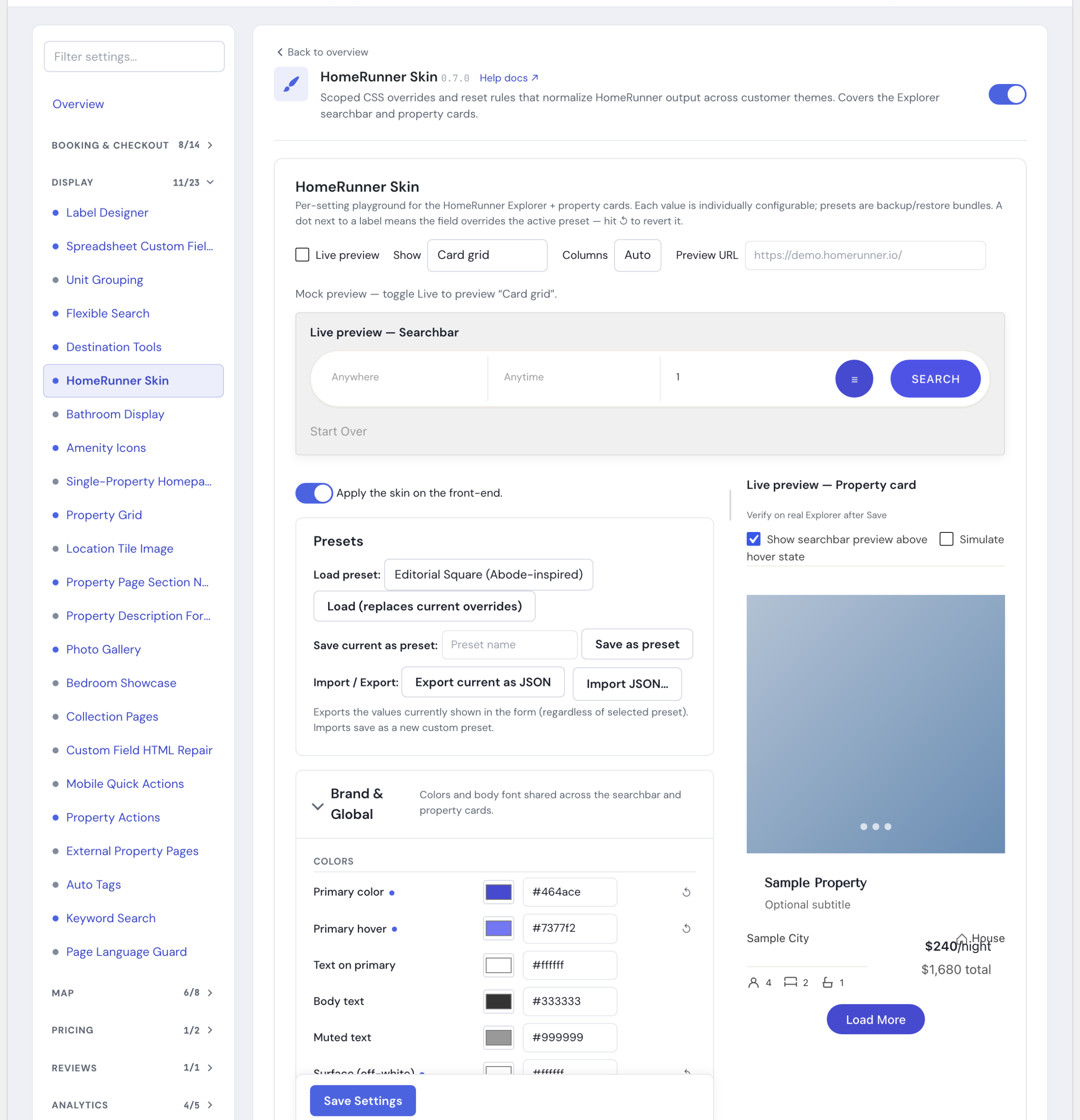
You work in a side-by-side editor: change a setting on the left, and a preview of the search bar and a sample property card updates on the right. A built-in live preview panel can also show you the real search bar and cards rendered from your own site, so you are not just guessing from a mockup. When you like what you see, you save and it goes live. For example, you can set property card images to a square 1:1 ratio, switch the brand color to your own dark teal, move the price above the title, and hide the field labels in the search bar, all from the same screen.
Each value is individually adjustable, and you can save a combination as a named preset to back up, restore, or move between sites.
How to turn it on #
1. Open the Toolkit Hub #
Go to HomeRunner → Toolkit in your WordPress admin.
2. Enable HomeRunner Skin #
Switch on HomeRunner Skin in the module list, then open its settings panel.
3. Choose how it applies on the front end #
The panel opens with Apply the skin on the front-end already on, using the Default preset. The Default preset is theme-neutral: it carries HomeRunner’s tidy-up rules but does not impose any colors or fonts of its own, so visitors will not see a sudden change until you start customizing. While you are experimenting with a bigger redesign, you can turn Apply the skin on the front-end off so visitors keep seeing the current look until you are ready.
4. Customize, then save #
Adjust the settings, or load a built-in preset as a starting point, and watch the preview update. Turn on Live preview if you want to check your changes against the real search bar and cards on your own site instead of the built-in mockup. Click Save Settings when you are happy.
Settings #
Settings are grouped into panels so you can focus on one area at a time. Every value has its own control, with sliders and color pickers showing a live readout as you adjust them.
| Setting | What it controls |
|---|---|
| Apply the skin on the front-end | The master switch that makes your saved styling visible to visitors. On by default once the module is enabled. Turn it off to keep the current look live while you experiment. |
| Brand & Global | Shared colors (primary, hover, text, muted, text on primary, surface, borders, dividers) and the body font family used across both the search bar and property cards. |
| Searchbar | Everything that styles the property search form: search and filter button colors, button radius and size, input background, radius and font size, field label font size, field label and divider visibility, search bar shape and shadow, the filters modal, field spacing, the Start Over button style (button or a minimal text link), the search button’s text case (as typed, or uppercase), and whether the bar is inline or floating (with an optional sticky-on-scroll behavior and floating max width). |
| Property card | Everything that styles the result cards: title font and size, card corner radius and shadow, image aspect ratio (square, 4:3, 16:9, and others) that overrides the slideshow’s natural-ratio sizing so every card image locks to the same shape, slideshow radius and dot size, meta icon size, the order in which the image, card body, and specs row stack (Card section order), whether location or specs comes first in that row (Location & specs order), whether the price sits before or after the title (Price placement vs title), the price row’s own font size and text color, the title/location/type row arrangement (stacked, or spaced out in a row), the location/city color (inherits the card text color by default so it matches the property-type label), the guests / beds / baths row’s bottom-anchored alignment with a consistent gap between items, price arrangement and position, the Load More button’s background, text, and hover colors, its corner radius, and its alignment (center, left, or right), and the visibility of the subtitle, type icon, dividers, and tax line. Card section order, location/specs order, and price placement each default to the standard HomeRunner arrangement until you change them; the Load More button colors have no default of their own and follow your Brand & Global primary color until you set them. |
| Specs display (guests/beds/baths) | How the guests / beds / baths line renders inside the card. icons (default) keeps the small icons. text drops the icons in favor of inline labels with pipe separators (for example “Sleeps 4 | 2 BR | 1 BA”). |
| Specs font size (guests/beds/baths) | A dedicated size control (10-24px) for the guests / beds / baths line, so you can shrink or enlarge it independently of the card title or other secondary meta. |
| Live preview | A preview built right into the settings screen. It opens showing a mock search bar and property card so you can see the effect of each change without leaving the page. Switch on Live preview to swap in a real, same-origin view of your site instead: pick Card grid, Single card, or Searchbar only, or (when HomeRunner finds a page with your search results on it) Full page. Use Columns to force the grid or card preview to 1, 2, 3, or 4 columns so you can check layouts at a glance, and drag the resize handle on the live preview to see how cards reflow at narrower widths. An optional Preview URL field lets you point the preview at a specific page; leave it blank and HomeRunner looks for a page with your search results automatically. If a live preview cannot load, it falls back to the mock version and tells you why. This preview is only ever reachable by a logged-in administrator; your site’s visitors never see it and it has no effect on the live front end. |
| Image dimensions | The pixel dimensions HomeRunner uses for property images in the map view, the Explorer grid, and checkout. These write through to your HomeRunner plugin’s Property Image settings. Changing them starts a background image regeneration, so existing thumbnails will not appear at the new size until that finishes. |
| Presets | Save your current settings as a named preset, load a preset to replace the current values, or delete a custom one. Ships with two built-in presets: Default (resets only) (the theme-neutral baseline) and Editorial Square (Abode-inspired) (square corners, a dark-teal brand color, a distinctive display font for titles, and 1:1 card images). |
| Import / Export | Export the values currently shown in the form as a JSON file, or import a JSON file to save it as a new custom preset. Useful for copying a look from one site to another. |
Tips #
- Turn off Apply the skin on the front-end while you tune a large change, then switch it on once you are happy, so visitors only ever see a finished look.
- Use a built-in preset as a head start: load Editorial Square (Abode-inspired) to see how the controls work together, then adjust from there.
- Switch on Live preview and try the Card grid or Full page scene when you want to sanity-check a layout change (like a new card section order) against your real properties rather than the mockup.
- If your site’s front end and admin live on different domains, live preview stays on the mock version. Save your changes and check the real Explorer page directly instead.
- Save a preset, or export your settings as JSON, before a big round of changes so you have an easy restore point.
- HomeRunner Skin is being expanded over time. The search bar and property cards are covered today; more areas are on the way.
- Pair it with Label Designer for badges on those same cards, and see Searchbar Pro for added search behavior. Back to the Toolkit overview or Under the Hood.