
Mobile Quick Actions keeps your header’s most important buttons (Book Now, phone, contact, and search) visible next to the mobile menu icon, instead of letting them disappear once the header collapses for small screens.
What it does #
On a phone or small tablet, most vacation rental headers collapse down to just a logo and a hamburger menu icon once the screen gets narrow. That buries the actions guests use most, calling you, booking a stay, reaching support, searching your site, one extra tap deep inside the menu. Mobile Quick Actions solves this by copying those buttons into the mobile header itself, right next to the menu icon, so guests can act immediately without opening the menu at all.
In plain terms: the module looks at the button group in your desktop header and copies each action you have turned on into the mobile header, in a fixed order (booking button, then phone, then contact, then search). As the screen gets narrower and room runs out, buttons drop away one at a time once the screen gets too narrow for them, based on minimum widths you set. For example, the booking button might stay visible all the way down to 500 pixels wide, while the contact and search buttons (sharing the same 640 pixel threshold) disappear together at that point. Every copied button still opens the exact same booking form, contact panel, or search overlay as its desktop counterpart, so nothing needs to be built or maintained twice.
What guests and operators experience:
- Guests keep one-tap access to Book Now, call, contact, and search from the mobile menu bar, even before they open the hamburger menu.
- Buttons drop away one at a time as the screen narrows, in an order and at widths you control, so your most valuable action can stay visible the longest.
- Tapping a mobile copy of a button opens the exact same booking component, contact form, or search overlay a desktop visitor would get. There is nothing new to build or keep in sync.
How to turn it on #
1. Turn on the module #
In the HomeRunner Toolkit Hub, switch on Mobile Quick Actions.
2. Point it at your header #
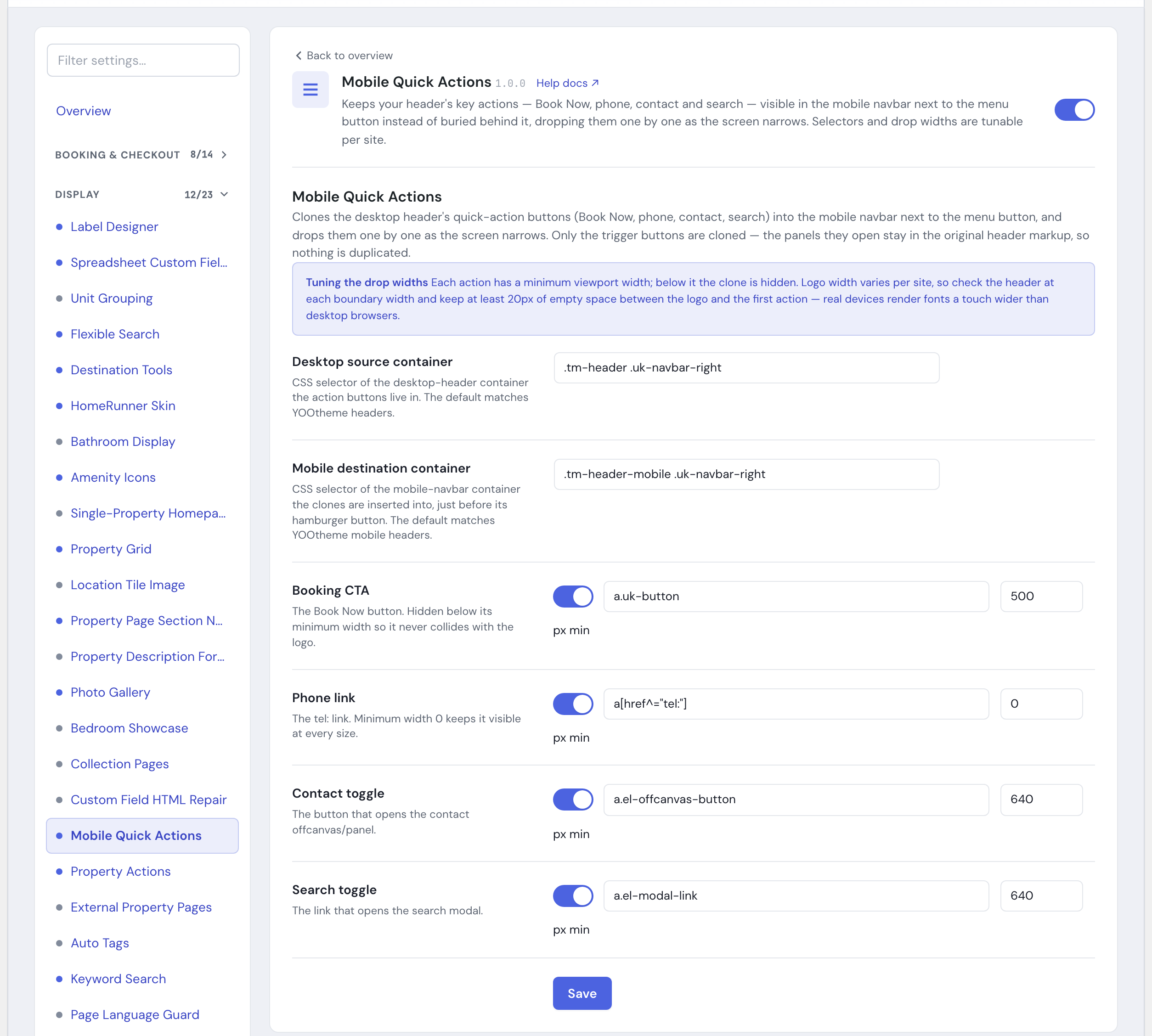
Open the module settings and check the Desktop source container and Mobile destination container fields. These are the containers the buttons are copied from and copied into. The defaults are tuned for a YOOtheme-based header, so if your site uses a similar builder and header layout, you can typically leave them as is.
3. Choose which actions to show, and where they drop off #
For each of the four actions, Booking CTA, Phone link, Contact toggle, and Search toggle, confirm it is switched on, confirm its selector points at the correct button in your header, and set the minimum screen width at which it should disappear.
4. Save, then check on a real phone #
Save your changes, then load the site on an actual phone (not just a resized desktop browser window) around each of your chosen widths. Real devices render text a little wider than desktop browsers, so leave some breathing room, at least 20 pixels of empty space between the logo and the first action, at every threshold you set.
Settings #
| Setting | What it controls |
|---|---|
| Desktop source container | The container in your desktop header that holds the action buttons to be copied. Default: .tm-header .uk-navbar-right (a YOOtheme header layout). |
| Mobile destination container | The container in your mobile header the copied buttons are inserted into, placed just before the menu (hamburger) icon. Default: .tm-header-mobile .uk-navbar-right (a YOOtheme mobile header layout). |
| Booking CTA (on/off, selector, minimum width) | The Book Now button. On by default, matching a.uk-button, hidden below 500 pixels wide. |
| Phone link (on/off, selector, minimum width) | The tap-to-call link. On by default, matching a[href^="tel:"], with a minimum width of 0, meaning it stays visible at every screen size. |
| Contact toggle (on/off, selector, minimum width) | The button that opens your contact panel. On by default, matching a.el-offcanvas-button, hidden below 640 pixels wide. |
| Search toggle (on/off, selector, minimum width) | The link that opens your search overlay. On by default, matching a.el-modal-link, hidden below 640 pixels wide. |
Each minimum width can be set anywhere from 0 to 2000 pixels. Clearing a container selector reverts it to its default value. Clearing an action’s own selector instead turns that action off, since there is nothing left to copy.
Tips #
- The four actions always appear in the same order in the mobile bar (Book Now, phone, contact, search), no matter which ones you turn off. You can change which ones show and where they drop off, but not their left-to-right order.
- If a button is not appearing on mobile, the most common cause is a selector that does not match your theme. The defaults are built for a YOOtheme header, so if your site uses a different theme or a customized header, update the Desktop source container, Mobile destination container, and each action’s selector to match your actual markup.
- Mobile Quick Actions only copies the button itself, never the form, panel, or script it opens, so it pairs well with your existing site navigation setup. See Toolkit: Admin Menu for the mobile menu it sits alongside.
- To get more value, walk your header down through each width tier on a real phone and nudge the minimum widths until buttons drop off exactly where your logo and menu icon would otherwise start to crowd them, rather than leaving the defaults tuned for a different header.