
A family of small upgrades to how your property map looks and behaves, so the map feels modern and on-brand on desktop and stays fast and easy to use on phones.
What it does #
Property Map Display is a set of related modules in the Toolkit Hub that each polish a different part of your map. Turn on only the ones you want. Between them they cover the look of your maps, how the markers behave, how the map sizes itself and reacts to hover and scrolling on desktop, how it works on phones, and how zoomed-in it starts on a property page.
- Map Styling gives your maps a custom color theme (for example a soft warm-sand look instead of the stock Google gray), and can swap in Mapbox raster tiles as a different kind of base map entirely, including a Brand style that HomeRunner tints to your site’s own color palette. It applies to YOOtheme Pro map elements, the map on your property detail pages, and (for Mapbox) the search and explorer map itself.
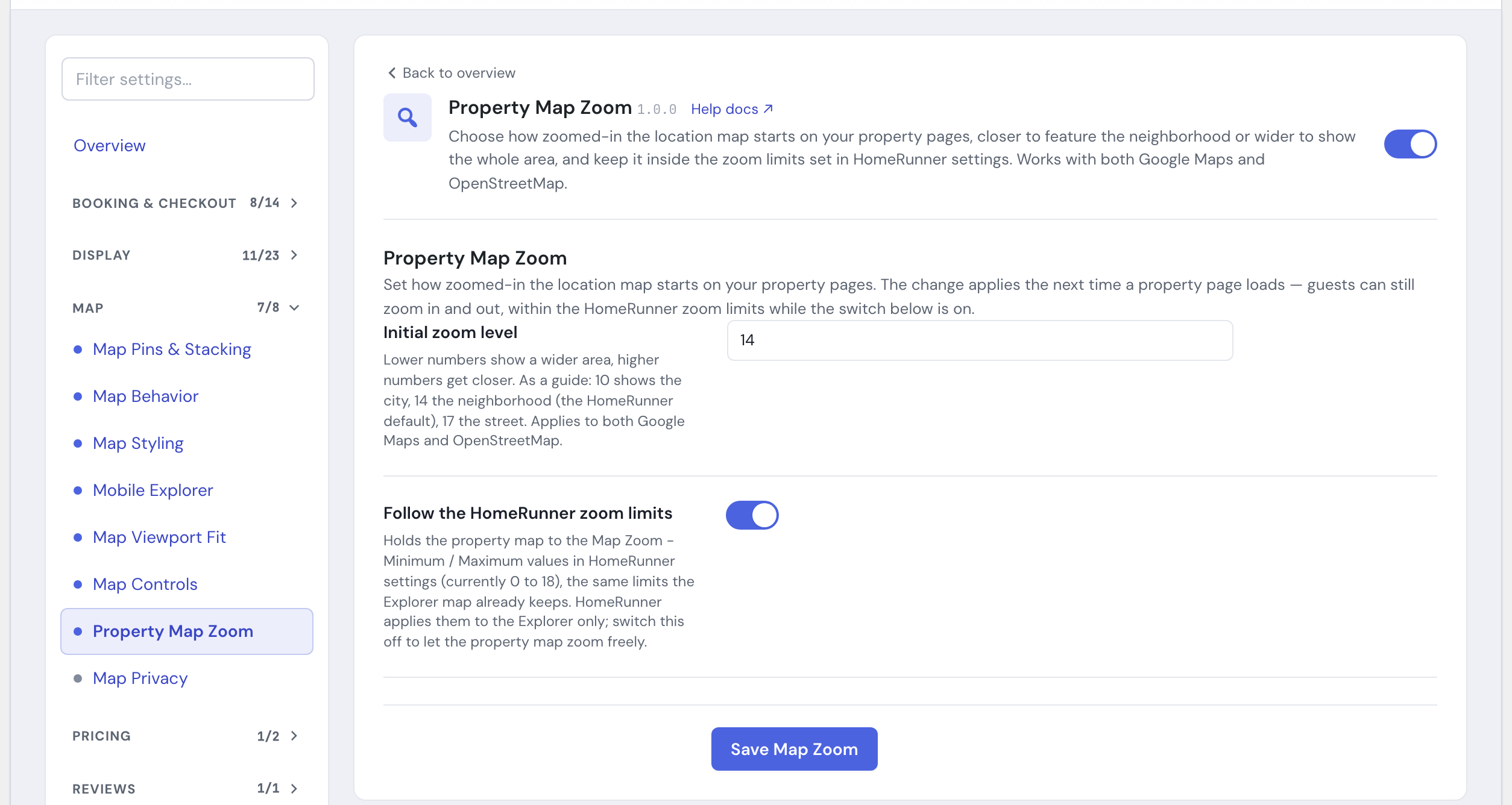
- Property Map Zoom sets how zoomed-in the map on your property detail pages starts, from a wide view of the surrounding area down to a close-up of the street, and can hold that zoom within your HomeRunner zoom limits so a guest cannot zoom the property map past them. It works with both Google Maps and OpenStreetMap (Leaflet).
- Map Stacking fans out pins that sit on the exact same spot so a guest can reach every property, highlights the marker for whatever property a guest hovers in the list, controls the colors of the markers and price pills on the search map, and can optionally recolor clustered pins by how many properties they hold. Colors left at their defaults follow the site brand palette.
- Map Controls cleans up the search map’s control buttons into a modern, Airbnb-style layout, and lets you set how much of the results page the map takes up on desktop.
- Map Viewport Fit keeps the desktop explorer map sized to exactly fit the visible browser window instead of hanging off the bottom of the screen or creeping up while scrolling, and keeps the results grid steady while new listings load.
- Map Polish bundles three small map fixes into one toggle: the map stays still when a visitor hovers a property card, zooming stays smooth instead of overshooting, and touch gestures on phones behave the way guests expect.
- Hide Map on Mobile hides the search-results map by default on phones so guests see your listings first, with the map one tap away.
- Mobile Explorer turns the search page into a full-screen, map-first layout on phones, the way a travel app works.
- Explorer Map Mobile Dock and Search As I Move Default smooth out the rough edges of the standard search map on phones. Mobile Map Framing does too, but it is being retired (see below).
How to turn it on #
1. Switch on the pieces you want #
Each piece is its own toggle in the HomeRunner Toolkit Hub. Switch on the ones you want:
- Map Styling
- Property Map Zoom
- Map Stacking
- Map Controls
- Map Viewport Fit
- Map Polish
- Hide Map on Mobile
- Mobile Explorer
- Mobile Map Framing
- Explorer Map Mobile Dock
- Search As I Move Default
The Hub keeps the related toggles together in two panels. Map Pins & Stacking holds the two modules that decide what appears on the map and how crowded pins behave. Map Behavior holds the toggles that shape how the map acts on phones and desktop: Map Polish, the results dock, search-as-you-move, and two older mobile framing toggles that are being retired. Map Styling, Map Controls, Map Viewport Fit, Mobile Explorer, and Property Map Zoom are their own rows in the Map section.
2. Open the settings panels for the modules that have them #
Map Styling, Property Map Zoom, Map Stacking, Map Controls, Map Viewport Fit, and Mobile Explorer have settings panels (see Settings below). The rest take effect as soon as they are enabled, with nothing else to configure.
3. Save each panel you change #
Each panel has its own Save button. Changes apply the next time a page loads on your site.
Mobile map experience #
On a phone, a map crammed above a list of properties is hard to read and easy to scroll past. These modules make the map feel like the map view in a travel app, so guests can browse your properties on a phone without fighting the screen.
You have two ways to do this, and they take opposite approaches. Pick one.
Two older toggles, Hide Map on Mobile and Mobile Map Framing, are being retired. If your site already has one switched on, it keeps working exactly as before and you can still turn it off, but neither can be newly switched on, and once off they will not reappear in the Hub. For a new setup, use Mobile Explorer for a map-first phone layout, or leave the map in its default place for the grid-first approach described below.
The map-first option is Mobile Explorer. It turns your search page into a map-led layout on phones, the way Airbnb’s app works: a full-bleed map fills the screen, and your results sit in a draggable sheet at the bottom with three positions, from nearly full-screen down to a small peek strip over the map. A floating List button lets the guest jump straight between the map and the results. Because it owns the whole mobile map layout, it handles its own pin framing.
The grid-first option is Hide Map on Mobile. It keeps your standard results layout and simply holds the map back on phones, so guests land on your listings and the map is one tap away when they want it. Choose this when your photos and property cards do more selling than the geography does.
By default Mobile Explorer shows its own compact header on phones (your site icon, a search pill, and a menu button) and hides your theme’s normal mobile navigation underneath it. If your theme’s header still shows through and clashes with that header, turn on Below theme navigation instead: the sheet drops its own header and tucks its search pill underneath your theme’s existing mobile nav bar, offset down by however much clearance that bar needs.
The two cannot run at once, because they position the map in incompatible ways. The Hub keeps them apart for you: switching on Mobile Explorer turns off Hide Map on Mobile (and Mobile Map Framing, for the same reason), and the other way around.
If you would rather keep the standard search layout and just sand down the rough edges on phones, use the supporting toggles in the Map Behavior panel:
- Mobile Map Framing fits the map to your property pins when it first loads and leaves room at the top for the floating search and filter bar, so pins are never hidden behind it. This toggle is being retired (see above); Map Polish, described below, already smooths out phone gestures on the standard layout regardless of this toggle.
- Search As I Move Default refreshes the list of properties for the new area as the guest pans or zooms the map, with no separate button to tap. It switches itself on the first time a guest actually moves the map, which is a drag, a one-finger pan, or a two-finger pinch. Until then the map’s own “Search as I move the map” control stays hidden, and it appears already switched on at that moment. Waiting like this matters: turning it on during page load would narrow the results to whatever the map happened to frame, so a guest’s first view would show fewer homes than you really have available.
- Explorer Map Mobile Dock docks a tapped pin’s info card to the bottom of the screen, with the photo on the left and the details on the right, instead of letting it cover the pin the guest just tapped. It works alongside Mobile Explorer as well as the standard layout; with Mobile Explorer on, the results sheet drops to its peek position when the card opens so the card is never hidden behind it.
Each of these is a simple on or off toggle in the Hub with nothing else to set. Because Mobile Explorer already covers framing on its own, pair the supporting toggles with the standard layout rather than with Mobile Explorer.
Map pins and stacking #
The Hub gathers the map’s pin system into one panel called Map Pins & Stacking. It holds two modules: Map Stacking, which spreads and groups pins that crowd each other, and Map All Pins, which keeps every home matching a guest’s search on the map even as the cards page through. They work independently, and they cooperate when both are on: the extra pins from Map All Pins fold into the same clusters Map Stacking creates. Map All Pins works on both the Leaflet map and Google Maps, matching whichever one your site is set to, and it has its own article, Toolkit: Map All Pins.
When two or more properties sit at the very same spot on the map, their pins land right on top of each other and a guest can only see one. Map Stacking notices these overlaps and, when the guest taps the stack, fans the pins out (a “spiderfy” effect) so each property gets its own tappable marker. If the guest then pans or zooms so the open stack scrolls off the screen, it closes itself again, so a fanned-out stack never clings to the edge of the map. It also lets you set the colors of the markers and price pills on the search map (see Settings).
When a guest hovers a property in the results list, Map Stacking highlights that property’s marker on the map so the guest can spot it without hunting for it. You can set the highlight color with the Focus Highlight Color setting. Turn the module on in the Hub. It works alongside the mobile map modules.
Map Stacking works on both kinds of map your site might use, the Leaflet map and Google Maps. It matches whichever one your site is set to on its own, so there is nothing to pick. If your search map is set to group nearby pins into a single numbered marker when it is zoomed out, Map Stacking works with that grouping too: the numbered markers split apart as the guest zooms in, and the fan-out still works for any pins that share the exact same spot. That zoomed-out grouping is a setting on the map itself (Enable Marker Cluster in your HomeRunner Explorer map settings), not part of this module, so turn that on first if clustered pins are not appearing.
On a Leaflet map, you can also give those clustered pins their own look. Use Bundled Cluster Marker replaces the plain default cluster icon with a scalable marker whose color ramps up by how many properties it holds, so a guest can tell a dense cluster from a light one at a glance. It is off by default, so turning on clustering never changes an existing site’s look without you asking for it, and it has no effect on Google Maps, which draws its own cluster icons. If you have already set your own custom cluster icon images in the HomeRunner map settings, those keep showing even with this switched on.
Map controls, fit, and polish #
Three upgrades keep the search map itself feeling tight, predictable, and current, on both desktop and phones.
Map Controls replaces the map’s cluttered stock controls (separate zoom buttons, unused home/previous/next marker buttons, a plain search-as-you-move checkbox, a text “HIDE MAP” link) with a floating zoom stack, a centered search-as-you-move pill, and an on-map hide/show toggle, the way Airbnb’s map controls work. It can also offer a Search this area button after a guest moves the map with search-as-you-move off, and on desktop it lets you set how much of the results page the map occupies, per screen-size breakpoint. See Toolkit: Map Controls for the full settings.
Map Viewport Fit keeps the desktop explorer map sized to exactly fit the visible browser window, so it never hangs off the bottom of the screen or creeps up while scrolling. If your site has a fixed navigation bar that overlaps the map, use the Sticky top offset setting to start the map below it. Use Bottom gap if you want a little breathing room instead of the map sitting flush against the bottom of the window (see Settings below). The module also keeps ordinary page scrolling from counting as map movement: if the map’s “Search as I move the map” option is on, the small size adjustments made while the page scrolls no longer re-run the search, so results only refresh when a guest actually drags or zooms the map.
Map Polish bundles three small map fixes that used to be three separate toggles (Map Hover Pan Lock, Map Zoom Damping, and Map Gestures) into one. The map stays still instead of panning or re-centering when a visitor hovers a property card on desktop, so hovering never reshuffles the results a visitor was reading. Momentum scrolling from a Magic Mouse or trackpad no longer sends the map several extra zoom levels past where the guest meant to stop. One-finger panning and two-finger pinch-to-zoom work the way guests expect on a phone, without the page scrolling or zooming by accident, and dragging the map no longer highlights text on the map or the property cards, on both desktop and mobile. If your site already had any of the three older toggles on, Map Polish switched on automatically in its place: nothing about how the map behaves changed, only the name. It is a single on/off toggle with nothing to configure.
Map styling #
Stock Google maps come in a flat gray that rarely matches a property brand. Map Styling gives you two different ways to change that: a color-theme overlay for maps that stay on Google’s own imagery, and, separately, Mapbox raster tiles that replace the base map imagery outright, including on the search and explorer map.
Color theme #
You set the look by pasting a map style array into the Style JSON setting. The easiest way to get one is to pick or build a theme on Snazzy Maps and copy its style array, but any valid map style array works. Leave the box blank and your maps use the bundled warm-sand theme instead.
The style applies to two places: the YOOtheme map elements you place on your pages, and the map on your property detail pages. The module works out which kind of map is on each page on its own, so there is nothing extra to set for it to find the right one. This color theme only restyles Google’s own map tiles, and where Mapbox Tiles (below) is turned on for a target, Mapbox wins there instead.
Mapbox Tiles #
Mapbox Tiles is a different mechanism from the color theme above: instead of restyling Google’s map, it swaps the base map imagery itself for tiles pulled from your own Mapbox account, including on the search and explorer map, which the color theme cannot touch. Where you turn Mapbox on for a target, it replaces the color theme there.
You will need your own Mapbox access token (a public pk. token; a secret sk. token is rejected, since the token has to be published to the page for tiles to load). Then pick a Map Style: one of Mapbox’s built-in looks, the Brand style HomeRunner tints to your site (see below), or a custom style you built in Mapbox Studio. Before you save, press Test token to fetch one real tile with the token and style you have typed, so you know they work.
Mapbox requires its logo and a text credit on every map that uses its tiles, so both render automatically on any map Mapbox Tiles applies to; there is no way to turn them off. Mapbox also bills tile requests against your own account’s usage: turning this on for the Explorer, YOOtheme maps, or property maps means those page views draw from your Mapbox plan, so it is worth checking your plan’s limits before enabling it broadly, especially on the Explorer where most guests browse.
On a YOOtheme map element, Mapbox Tiles works with whichever map provider that element is set to. On the Leaflet provider it swaps the same OpenStreetMap tiles the Explorer uses, at the same tile cost per view, and falls back to OpenStreetMap if the tiles fail to load. On the Google provider it costs roughly four times as much per view instead, since Google’s tile grid does not line up with Mapbox’s, and falls back to standard Google tiles instead of OpenStreetMap if the tiles fail to load. The map on your property detail pages works the same way: the Leaflet cost and fallback on a Leaflet site, the Google cost and fallback on a Google site.
Brand style #
The Map Style list includes a Brand option: a Mapbox Studio style that HomeRunner generates from your site’s own color palette. The base map’s land, water, parks, and roads are re-tinted to match your site while the map stays fully readable, so your search and property maps look like part of your brand instead of a generic Mapbox default.
HomeRunner sets this style up for your site; there is nothing to paste or configure yourself. Until it has been set up, the Brand option shows in the list but is greyed out, and the panel says the style is not provisioned yet. Contact support to have it generated. Once it is in place the option becomes selectable, and choosing it reveals a read-only Brand Style row showing the style reference so you can tell a HomeRunner-managed style from one you pasted yourself. If you try to save with Mapbox Tiles on and Brand selected before the style exists, the panel refuses the save and tells you why, so a half-configured Brand choice never reaches your site.
Switching to another preset later keeps the Brand reference on file, so you can come back to it without asking for it again. Test token works with Brand too and checks a tile from the brand style itself. If a Brand selection is ever left in place with no style behind it, your maps quietly serve the standard Streets look rather than going blank.
Property Map Zoom #
Property Map Zoom is a separate module for a different part of the same property detail page: how zoomed-in the map starts, rather than how it looks. HomeRunner itself always opens that map at one fixed zoom level, with no setting to change it. Turn this module on in the Hub and set Initial zoom level to the number that fits how you want to introduce a property: wider to show the surrounding area, closer to spotlight the immediate street. HomeRunner’s own default is zoom 14, so turning the module on without changing the number does not move anything until you do. The change applies the next time a property page loads. It works with both Google Maps and OpenStreetMap (Leaflet), matching whichever your site already uses.
By default, the module also holds the property map to the Map Zoom – Minimum / Maximum values set in your HomeRunner settings, the same limits already applied to the Explorer map (HomeRunner itself only reaches the Explorer with those two settings, so the property map used to ignore them entirely). With Follow the HomeRunner zoom limits switched on, a guest can still zoom the property map in and out, just not past those limits. The panel shows the current minimum and maximum next to the switch so you can see what it will hold the map to. Switch it off if you would rather let the property map zoom freely again, the way it worked before this toggle existed.
Settings #
Map Styling #
| Setting | What it controls |
|---|---|
| Apply to YOOtheme Maps | Turns the custom style on or off for YOOtheme map elements placed on your pages. On by default. |
| Apply to HomeRunner Property Maps | Turns the custom style on or off for the Google map on your single-property pages. On by default. |
| Style JSON | The map style array to apply. Paste a theme exported from Snazzy Maps, or any valid style array. Leave it blank and save to use the built-in warm-sand theme. Invalid JSON is rejected and nothing is saved. |
Mapbox Tiles #
| Setting | What it controls |
|---|---|
| Enable Mapbox Tiles | Master switch for this section. Off by default. While off, nothing in this section loads and no request ever reaches Mapbox. |
| Access Token | Your Mapbox public token (starts with pk.). A secret sk. token is rejected, since the token has to be visible in the page for tiles to load. Create one in your Mapbox account and consider restricting it to your domain. |
| Map Style | Which Mapbox base map to use: Streets (the default), Outdoors, Light, Dark, Satellite, Satellite Streets, Navigation Day, Navigation Night, Brand (HomeRunner’s style tinted to your site’s palette), or a custom style you built in Mapbox Studio. Mapbox Standard and Standard Satellite are left out on purpose, since they cannot be served as tiles. |
| Brand Style | Read-only. Shown only when Map Style is set to Brand. Displays the reference of the brand-tinted style HomeRunner provisioned for your site, or a note that it has not been provisioned yet. |
| Custom Style Owner / Custom Style ID | Only used when Map Style is set to a custom style. Your Mapbox username and the style’s ID from Mapbox Studio. Paste the full style reference or share URL into either box and it splits into both fields when you save. Build the style on a classic Mapbox basemap (Streets, Light, Dark, Outdoors, or Satellite Streets); a style based on Mapbox Standard cannot be served as tiles. |
| Custom Style Uses Satellite Imagery | Only used with a custom style. Off by default. Turn on if your Studio style includes Mapbox’s satellite imagery, so the additional credit Mapbox requires is shown. The built-in Satellite styles add that credit automatically. |
| Test token | A button, not a saved setting. Fetches one real tile using the token and style currently typed above so you can confirm they work before saving. The token is never included in the result. |
| Retina Tiles | Requests sharper tiles for high-density (Retina) screens. Counts the same against your Mapbox usage as a standard tile. On by default. |
| Apply to HomeRunner Explorer | Swaps the search and explorer map’s base tiles for Mapbox. On by default. Only takes effect when your site’s map provider is set to OpenStreetMap (Leaflet), and falls back to OpenStreetMap if the tiles fail to load. The small result maps in the Conversion Kit’s Trip Builder follow this switch too, so group-stay results match your search page. |
| Apply to YOOtheme Maps | Swaps the base tiles on YOOtheme Pro map elements, on whichever provider each element is set to. Off by default. Costs the same per view as the Explorer on the Leaflet provider; roughly four times as much on the Google provider. |
| Apply to HomeRunner Property Maps | Swaps the base tiles on the map on your property detail pages. Off by default. On a Leaflet site it costs the same per view as the Explorer and falls back to OpenStreetMap if tiles fail; on a Google site it overrides the color theme, costs roughly four times as much per view, and falls back to standard Google tiles. |
Property Map Zoom #
| Setting | What it controls |
|---|---|
| Initial zoom level | How zoomed-in the location map on your property detail pages starts, from 1 (widest) to 20 (closest). Default 14, the same as HomeRunner’s own. As a guide: 10 shows the city, 14 the neighborhood, 17 the street. Applies to both Google Maps and OpenStreetMap. |
| Follow the HomeRunner zoom limits | Holds the property map to the Map Zoom – Minimum / Maximum values in your HomeRunner settings, the same limits the Explorer map already keeps. On by default, so a guest can still zoom in and out but not past those limits. Switch off to let the property map zoom freely. |
Map Stacking #
| Setting | What it controls |
|---|---|
| Stacked Badge Color | The background color of the price pill on each marker. Default is a dark navy. At that default it follows the site brand ink from Toolkit Settings, and the count bubble follows the brand accent the same way (see Brand Palette). |
| Badge Text Color | The text color for the price and count on the badges. Default is white. |
| Count Bubble Color | The fill color of the small count circle shown on stacked markers and clusters. Default is blue. |
| Count Number Color | The color of the number inside that count circle. Default is white. |
| Center Dot Color | The color of the dot shown at the center of a fanned-out stack. Default is a dark navy. |
| Connector Line Color | The color of the dashed lines that connect the fanned-out pins back to the center. Default is a dark navy. |
| Focus Highlight Color | The outline color shown on a marker when a guest hovers its property in the results list. Default is blue. |
| Background Fade Opacity | How much the other markers fade while a stack is open, from 0 (fully hidden) to 1 (no fade). Default is 0.4. |
| Use Bundled Cluster Marker | Replaces the fixed cluster icon on Leaflet maps with a scalable marker that the colors below control. Off by default, so updating the plugin never changes how your existing clusters look. Requires Enable Marker Cluster in your HomeRunner Explorer map settings; that checkbox sits beside Google-only options but is the on-switch for clustering on both map providers. Has no effect on Google Maps, which draws its own cluster icons. |
| Cluster colors (5 tiers) | One color per cluster size tier, applied only when Use Bundled Cluster Marker is on: under 10 properties, 10 to 24, 25 to 49, 50 to 99, and 100 or more. Each tier also draws at a larger marker size than the last. Defaults ramp from blue at the smallest tier to a warm orange at the largest, so bigger clusters read as “hotter.” A site with its own custom cluster icon images set in the HomeRunner map settings keeps those images instead and is never recolored. |
Map Controls #
| Setting | What it controls |
|---|---|
| Fullscreen button | Keeps the map’s fullscreen button, restyled to match the new controls. Off by default. |
| “Search this area” button | After a guest pans or zooms the map while search-as-you-move is off, shows a “Search this area” button under the pill. Tapping it filters the results to the current map view and turns search-as-you-move on. Off by default. |
| Map width per breakpoint (%) | How much of the explorer the map occupies while visible, set separately for three desktop width ranges (960 to 1199px, 1200 to 1599px, and 1600px and up). The results grid takes the rest. Accepts 20 to 70. Leave a range blank to keep the default 45% split. Phone layouts are unaffected. See Toolkit: Map Controls for the full breakdown. |
Map Viewport Fit #
| Setting | What it controls |
|---|---|
| Sticky top offset (px) | Distance from the top of the browser window the map sticks at while scrolling. If your site has a fixed navigation bar, set this to its height so the map starts below it instead of sliding underneath. Leave blank (the default) to keep the theme’s own value. |
| Bottom gap (px) | Breathing room between the bottom of the map and the bottom of the browser window, so the map does not sit flush against the edge. Default 0, which pins it exactly to the bottom. |
Mobile Explorer #
The settings panel for this module is titled Explorer Mobile Sheet in the Hub.
| Setting | What it controls |
|---|---|
| Below theme navigation | Off by default, showing the sheet’s own compact header and hiding your theme’s mobile nav. Turn it on if your theme’s mobile header still shows through and clashes with the sheet; the sheet then drops its own site icon and menu button and relies on your theme’s nav bar instead. |
| Vertical offset (px) | Only used when Below theme navigation is on. How far to push the sheet’s search pill down so it clears your theme’s mobile header. Default 80; raise or lower it to match your theme’s header height. |
| Menu button selector | Only used when Below theme navigation is off. Tells the sheet’s own menu button which of your theme’s menu buttons to open. Leave empty (the default) to detect it automatically for common themes and page builders; if nothing is found, the sheet’s menu button is hidden. |
Tips #
- For a quick win on phones, switch on Mobile Explorer so visitors get the map-first, app-style layout, or use Hide Map on Mobile if you would rather they land on your listings first with the map one tap away. These are two takes on the same problem, so pick one.
- If your theme’s mobile header shows through behind Mobile Explorer’s own header, turn on Below theme navigation and tune the Vertical offset until the search pill clears your theme’s nav bar.
- On the standard layout, turning on Map Polish and Search As I Move Default together makes the search map feel native: smooth one-finger pan and pinch-zoom, and results that refresh as the guest explores. If your site already has Mobile Map Framing on from before it was retired, it still pairs well with these, framing pins clear of the search controls on load.
- Want your search map’s controls to look modern instead of stock? Map Controls is the fix, and its map-width setting is worth tuning if you run a wide desktop layout.
- If your site has a fixed header that overlaps the map on desktop, Map Viewport Fit‘s Sticky top offset setting is the fix.
- If guests report the search map zooming further than they meant to on a Mac, Map Polish is the fix.
- Want your property pages to open zoomed in tighter on the street, or pulled back to show more of the neighborhood? Property Map Zoom‘s Initial zoom level setting is the fix, separate from anything in Map Styling.
- If a property page seems to stop a guest from zooming out (or in) as far as you expected, check Follow the HomeRunner zoom limits under Property Map Zoom: it is on by default and holds that map to the same Map Zoom – Minimum / Maximum values as the Explorer, so a limit you set there now reaches the property page too.
- If you want maps that match your brand colors without changing tile providers, start with Map Styling‘s color theme. If you want a different base map look entirely, including on the Explorer, look at Mapbox Tiles instead, and check your Mapbox plan’s tile quota first: it costs the same per view as the Explorer on Leaflet-provider maps, but roughly four times as much on Google-provider maps.
- Want the Mapbox base map itself to carry your brand colors, on the Explorer too? Choose the Brand map style. If the option is greyed out, HomeRunner has not generated the style for your site yet; contact support and it becomes selectable once it is in place.
- If your clustered pins on the Explorer are not appearing at all, check Enable Marker Cluster in your HomeRunner Explorer map settings first: Map Stacking and its Use Bundled Cluster Marker coloring both depend on it, and it is easy to miss since it is listed beside Google-only options.
- To show each home as a shaded area instead of an exact pin, on both the property page and the search map, see Toolkit: Map Privacy. It works alongside every module here.
- For collapsing identical listings into one search result, pair this with Toolkit: Unit Grouping. To load every home in a filtered search onto the map at once, see Toolkit: Map All Pins. For overall site look-and-feel beyond maps, see HomeRunner Skin.