
Turns your mobile search results into a full-screen, map-first experience, Airbnb-style, so guests can browse listings and the map without feeling cramped.
What it does #
On a small screen, a results list and a map competing for the same space usually means one gets squeezed. Mobile Explorer solves that by giving mobile guests a full-bleed map as the primary view, with your search results living in a sheet that sits over the bottom of it. A floating Map/List button lets a guest flip between “see the map” and “see the list” without losing their place, their filters, or reloading the page.
This module was called Explorer Mobile Sheet until recently. Nothing about how it works changed, only the name.
What the guest experiences on mobile:
- The map fills the screen first, so they immediately see where listings sit relative to the area they searched.
- Results sit in a sheet along the bottom, always one tap away.
- The Map/List toggle switches views instantly, keeping whatever search and filters were already applied.
- Everything they can already do on your search results, browsing, filtering, following through to a property, still works. Only how it’s framed on mobile changes.
Desktop is untouched. This only changes how results present on mobile viewports.
The Toolkit gives you two ways to handle the map on phones, and they take opposite approaches. Mobile Explorer is the map-first one: the map leads and the results ride over it. Hide Map on Mobile is the grid-first one: your listings lead and the map stays out of the way until a guest asks for it. Hide Map on Mobile and Mobile Map Framing have both been retired: sites already using either keep it until they turn it off, but neither can be newly enabled, so Mobile Explorer is now the recommended approach.
Because this module takes over how the map and results are framed on mobile, it cannot run at the same time as Hide Map on Mobile or Mobile Map Framing. Turning Mobile Explorer on automatically turns those off, so you never have two systems fighting over the same map.
How to turn it on #
1. Open the Hub #
In the HomeRunner Toolkit Hub, find Mobile Explorer under the Map section. It ships off by default.
2. Switch it on #
Turn the module on. Your mobile search results immediately switch to the map-first, bottom-sheet layout described above. Because it owns the whole mobile map layout, enabling it turns off Hide Map on Mobile and Mobile Map Framing if either was active.
3. Adjust for your theme, if needed #
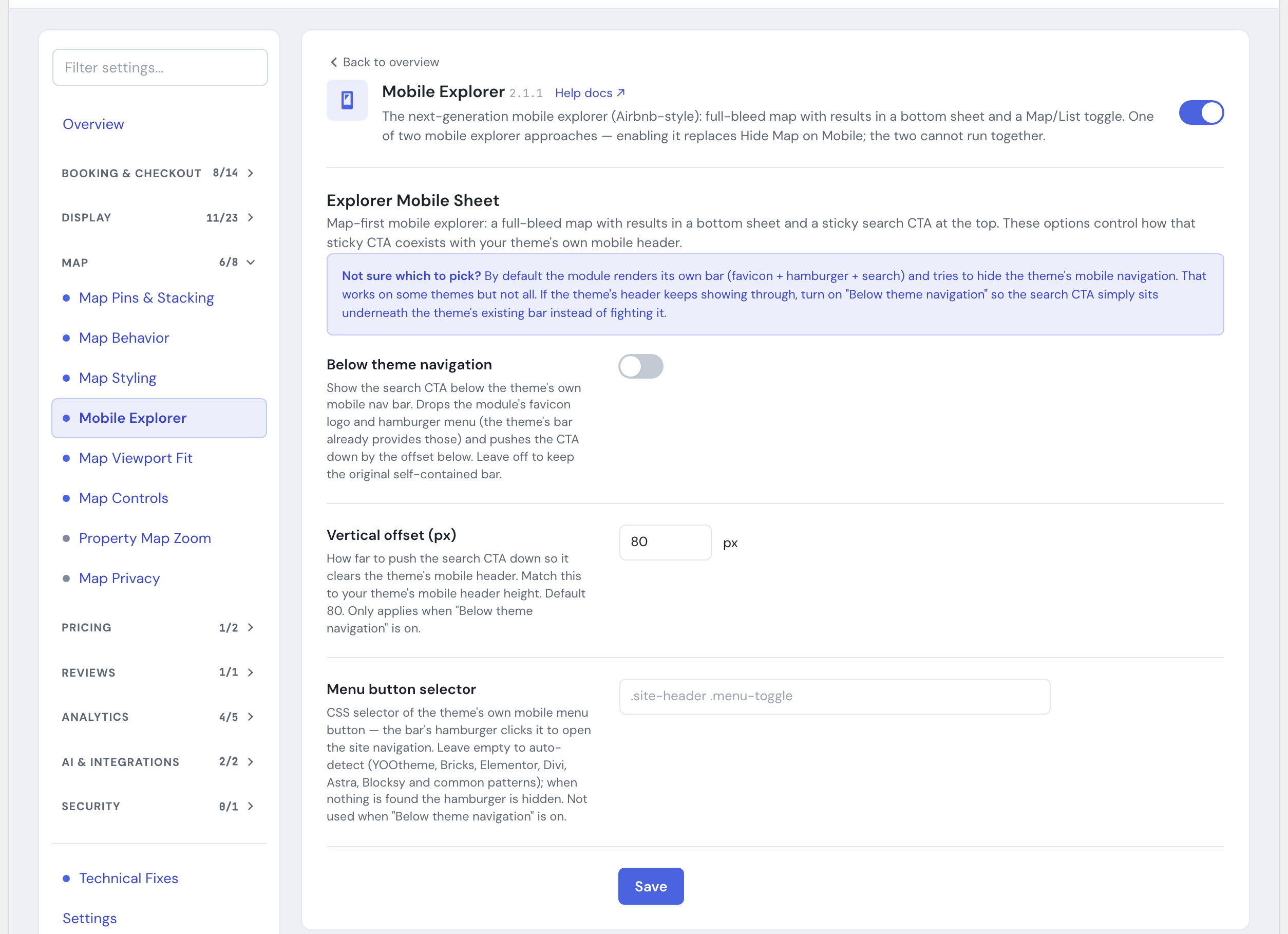
By default the module shows its own compact bar (logo and menu button) and hides your theme’s mobile navigation so the two don’t overlap. Tapping the menu button opens your theme’s own mobile navigation menu, the bar automatically recognizes the menu toggle used by most popular themes and page builders (YOOtheme, Bricks, Elementor, Divi, Astra, Blocksy, and other common patterns). If it can’t find one, the menu button hides itself rather than sitting there doing nothing, you can point it at your theme’s toggle by hand with Menu button selector in the module’s settings (see below). If your theme’s own mobile header still shows through underneath instead, turn on Below Theme Navigation in the module’s settings instead of fighting the overlap.
Settings #
| Setting | What it controls |
|---|---|
| Below Theme Navigation | Off by default. When on, the module drops its own logo and menu button (your theme’s mobile bar already provides those) and places the search button below your theme’s existing navigation bar instead of replacing it. Leave off to keep the module’s original self-contained bar. |
| Vertical Offset (px) | How far to push the search button down so it clears your theme’s mobile header. Default 80. Only used when Below Theme Navigation is on; match it to your theme’s mobile header height. |
| Menu button selector | CSS selector of your theme’s own mobile menu button, so the module’s menu button can open your theme’s real navigation. Leave empty to auto-detect (covers most popular themes and builders); if nothing is found, the menu button hides itself instead of doing nothing. Not used when Below Theme Navigation is on. |
Tips #
- If your theme’s own mobile navigation bar keeps showing through above the module’s search button, that’s the sign to turn on Below Theme Navigation rather than trying to hide the theme bar yourself.
- If the menu button is missing on your self-contained bar, your theme’s mobile nav toggle was not auto-detected. Find its CSS selector (your theme’s markup or browser inspector will show it) and enter it under Menu button selector.
- This changes the entire mobile search experience, so it’s worth trying on one site first before switching it on everywhere.
- If you already run Hide Map on Mobile and prefer that grid-first layout, you can keep it; there is just no longer a way to newly enable it now that it’s retired.
- Pair it with Toolkit: Property Map Display to keep the map experience consistent from search results through to the property page.
- See the Toolkit Overview for how this fits alongside the rest of the Toolkit’s map and search modules.