
Compare Homes lets guests line up two, three or four homes from your search results and see them side by side: photo, price, sleeps, bedrooms, bathrooms, location and amenities. It is a free Conversion Kit tool, off until you turn it on, and it needs no template changes.
What guests see #
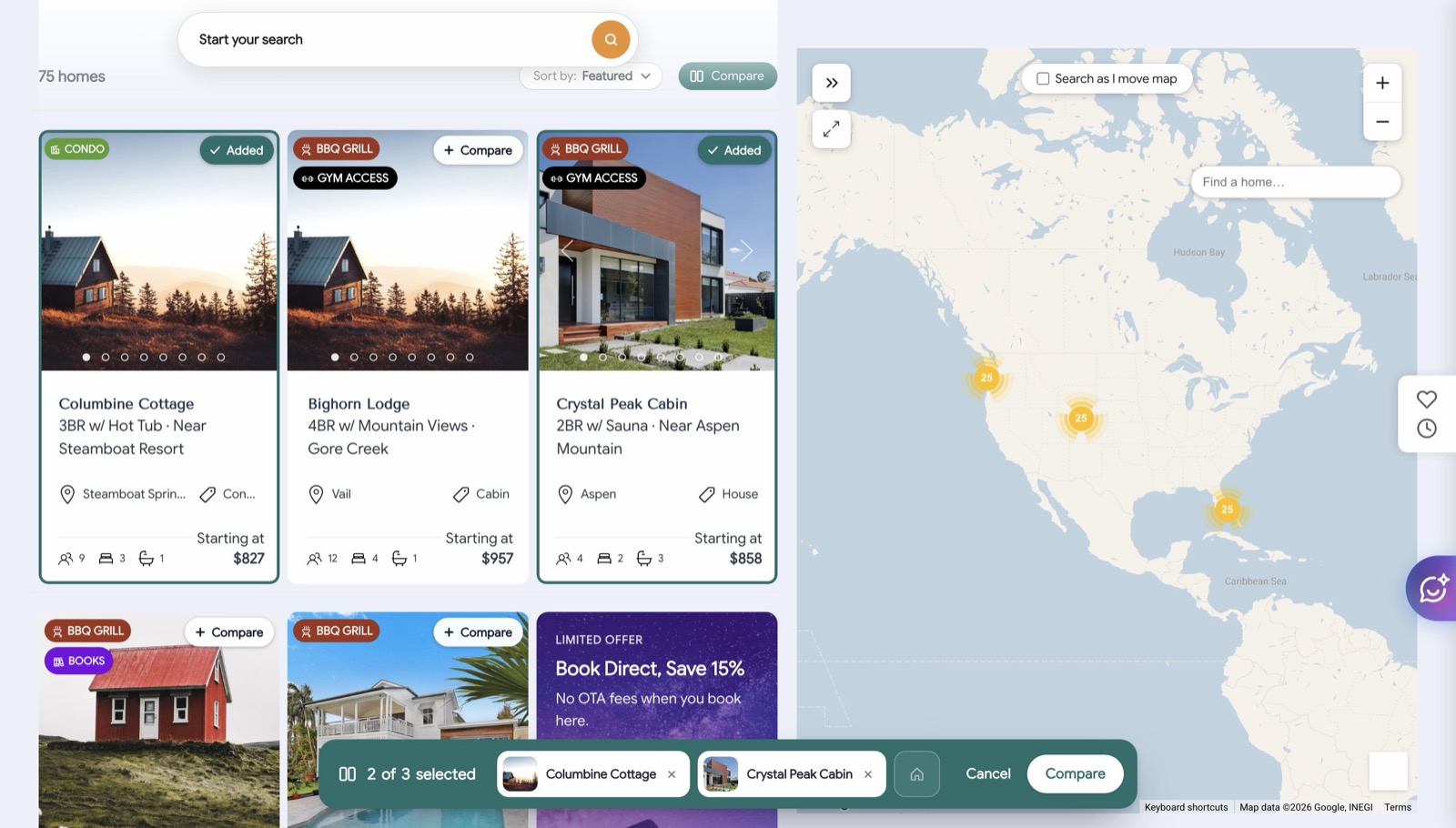
A Compare toggle sits above the search results, beside the sort control. On a page without a results header, a floating Compare button stands in near the bottom of the screen.
Turning it on puts a + Compare chip on every home card. A tap on the chip, or anywhere on the card, picks that home; the chip changes to Added and the card gets a colored outline. A second tap removes it. The photo arrows and dots still work, so guests can flip through pictures while they choose.
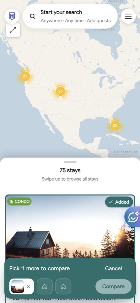
A tray at the bottom of the page shows the picked homes and how many more fit. It reads “Pick 1 more to compare” after the first pick, so guests know why the Compare button is not live yet. Cancel clears everything and the cards go back to normal.
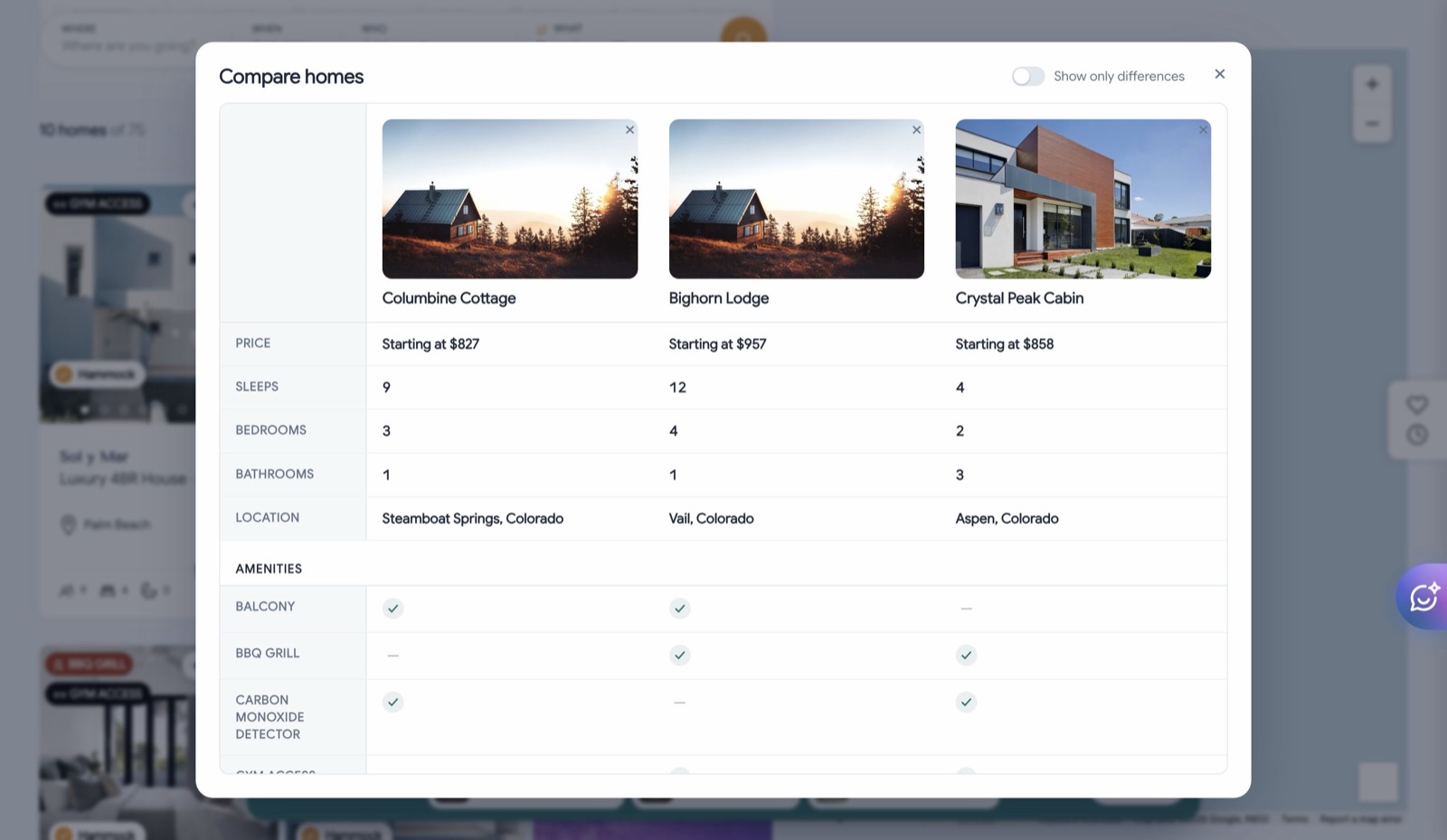
Compare opens the side-by-side table. Each column is one home with its photo, name and a View home link. Rows cover price, sleeps, bedrooms, bathrooms, location and an amenities check list. When the guest searched with dates, the price row shows the total for those dates; otherwise it shows the nightly rate. A Show only differences switch hides every row where the homes match, which is usually the fastest way to decide.
On phones the chips, tray and table all fit the screen, and the tray’s thumbnails stand in for the names.
Turning it on #
- In WordPress, open Conversion Kit and enable Compare Homes.
- Compare shows only on the full Explorer view: the results grid with its filter bar, which is your search page. A featured-homes slider on the home page or a search bar on its own never shows it, and there is nothing to configure for that.
- Set how many homes a guest can compare at once (2 to 4; the default is 3).
- Set the button text if you want a word other than Compare. The same word appears on the toggle, on each card’s chip and on the Compare button, so keep it to one or two words.
- Pick an accent color. It colors the Compare button, the picked outline and the Added chips. Text and surfaces follow your theme.
The default accent is a deep teal (#1f6f6b). Very pale accents make the picked state hard to see on white, so stay with a color that reads as an outline on a white page.
Good to know #
- The tool stores nothing. Picks are gone when the guest leaves the page, and nothing is sent to HomeRunner Central.
- Facts in the table come from the same data as your property pages. Amenities list the ones your properties carry; a home without a listed amenity shows “Not listed” rather than “No”.
- The comparison opens in a panel on top of the results, so guests return to the same list with their picks intact when they close it.
- Group Stays has its own compare inside its wizard. The two do not interact.
Related: Conversion Kit overview, Wishlist, Trip Planner.